How to choose white paint (there are 40 whites, and one is yours)
Undertones, light and a two-day test. How to find the right white in an afternoon.


- Where
- Size
- Room
- Budget
- Time
- Style
There are more whites on a paint chart than any other colour, and most of them look identical in the shop. On your wall, they will not. This is how to choose the one that is right for your room, in an afternoon, without buying twelve sample pots you will never use.
Why whites look different
A white paint is never just white. It has a small amount of another colour mixed in: a little yellow makes it warm, a little grey or blue makes it cool, a little red or pink makes it soft. That hidden colour, the undertone, is invisible on a small card and very obvious on four walls.
The second reason is light. A white that looks fresh in a south-facing room full of sun can look grey and sad in a north-facing room, because northern light is cooler and bluer all day long.
Start with the direction of the room
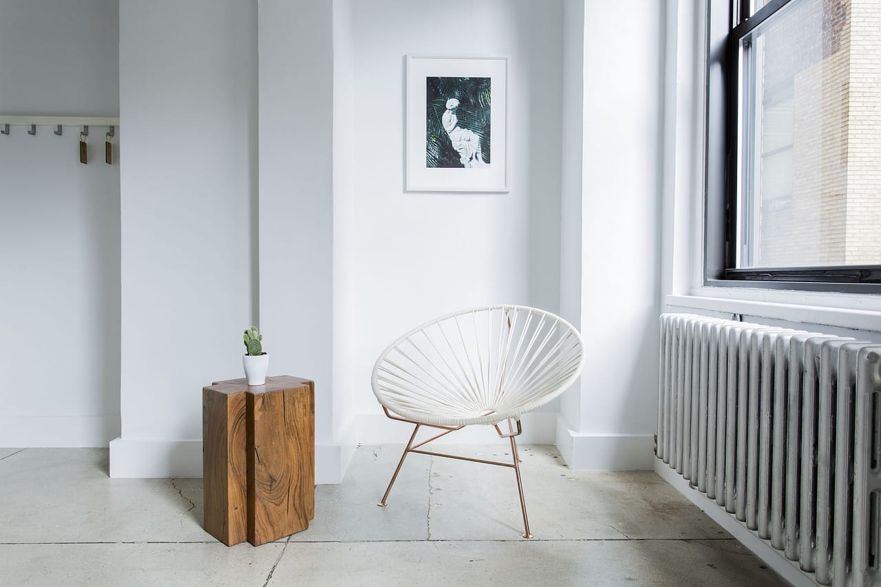
- North-facing: choose a warm white with a yellow or red undertone. It balances the cool light.
- South-facing: almost any white works. A cooler white keeps it fresh in the afternoon.
- East-facing: bright in the morning, cool later. A soft, neutral white suits both.
- West-facing: dull in the morning, warm and orange at sunset. A white with a slight grey undertone keeps evenings calm.
Six whites we come back to
We asked our contributors which whites they have used more than once. These six came up again and again. The names are ours; the colour codes are as close as a screen allows.
- #F4EFE6 Paper — a warm, clean white for north-facing rooms
- #EFE9DD Linen — soft and creamy, lovely with oak and wool
- #F2F1EC Chalk — the most neutral of the six, almost no undertone
- #E9E4DA Stone — a white with a little grey, calm in west light
- #F6F3EE Cotton — bright but not cold, for ceilings everywhere
- #E6DDCF Oatmeal — barely a white, very warm in the evening
Click a swatch to copy its colour code and take it to the paint shop, where most can mix a close match.
How to test
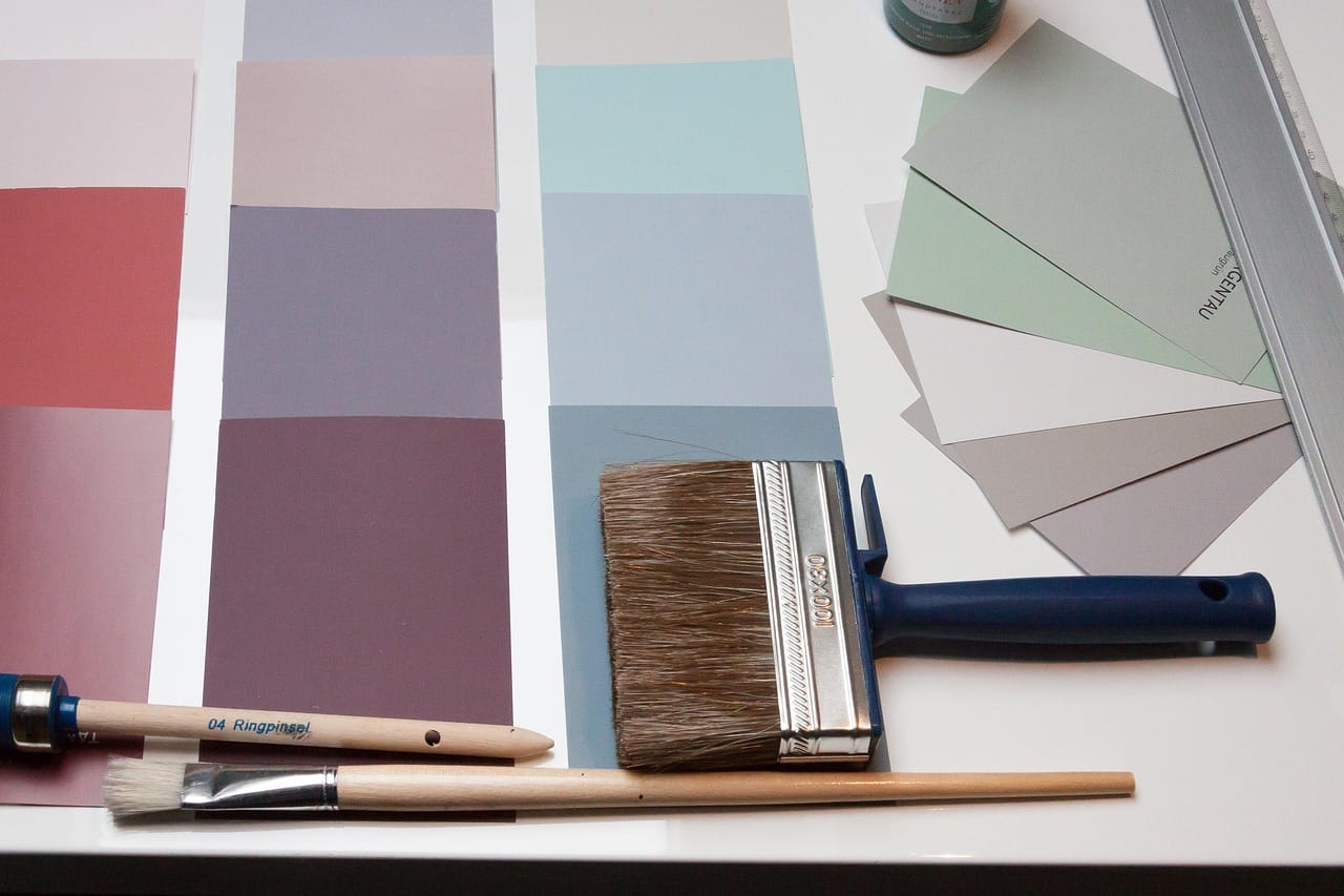
Buy three sample pots at most. Paint each one on a large piece of card, about A3, with two coats. Tape the cards to the wall in the darkest corner and the brightest one, and look at them at breakfast, in the afternoon and after dark with the lamps on.
After two days, one of them will look wrong. After four days, you will have a favourite. Trust the favourite.
Ceilings and woodwork
Paint the ceiling in the same white as the walls, or one step lighter, never in a brilliant white from a different family. A cool, bright ceiling above warm walls looks like a hospital.
For woodwork, the same white in a harder finish (eggshell or satin) looks calm and modern. A slightly darker shade looks traditional. Brilliant white gloss looks new-build, which may be what you want, but rarely in an old house.
The right white is the one you stop noticing after a week.
Maren Holt
What about pure white?
Pure brilliant white has optical brighteners, which make it look almost blue in daylight. It works in galleries, modern flats with big windows, and bathrooms. In most homes, and in almost every old house, a white with a little warmth looks cleaner, strangely, than white itself.
A shortcut
If you are still unsure after all this, choose the warmest white on the chart that still looks white to you, not cream. That one works in more rooms than any other.
Whites and your furniture
A white wall is also a background, and what you put in front of it changes it. Oak and linen make warm whites look warmer and cool whites look grey. Black metal and glass make cool whites look sharp and modern. If your furniture is mostly wood, lean warm; if it is mostly metal and glass, lean neutral or cool.
Hold your sample board next to the largest thing in the room, usually the sofa or the floor, before you decide. The wall and the sofa will be seen together for years; make sure they like each other.